


- Punch Boutique Poster
- Giudaismo e Paganesimo Poster
- Tour Eiffel 2 Poster
- La posizione attuale dei Mahatmas Poster
- Riley Blaze Poster
- La Paresse Poster
- Gatto nero 4 Poster
- Gatto nero 3 Poster
- Sherlock Holmes Poster
- Gatto Nero 2 Poster
- Solaris Poster
- Campanile di Pisa Poster
- Kabuki Poster
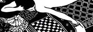
- Labbra Rosse Poster
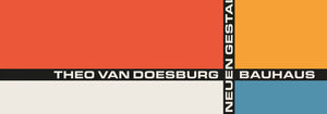
- Mostra del Bauhaus Poster
- Testa di donna Poster
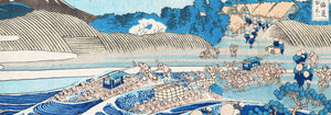
- Arte giapponese Poster
- Veduta della Torre Eiffel Poster
- Pegaso davanti a una nuvola Poster
- Maskers Poster
- Arte olandese contemporanea Poster
- Marihuana Poster
- Ponte di Lisbona Poster
- Surfista in Portogallo Poster
- Tram 28 di Lisbona Poster
- Alfama Poster
- Veduta della città vecchia di Lisbona Poster
-
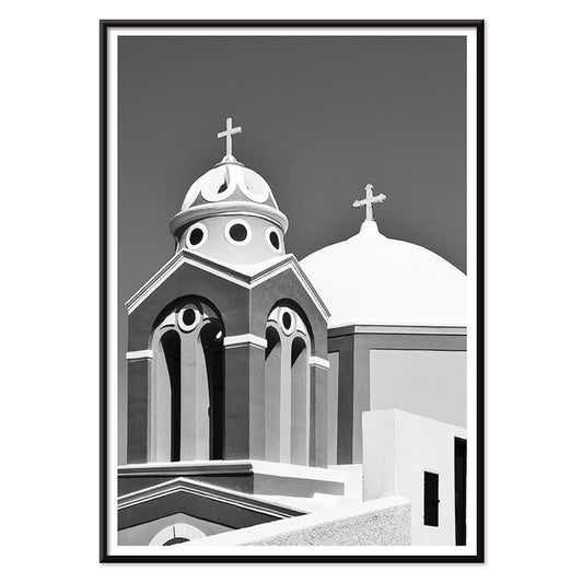
Santorini Poster
Artista sconosciuto · 2004 · Poster monocromatico con cupola della chiesa di Santorini e croce sullo sfondo del cielo egeo
Poster da €9 · Incorniciato da €16
Prezzo di listino Da €6,00Prezzo di listino -
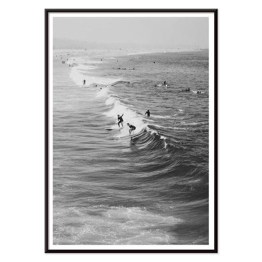
Surfisti a Venice Beach Poster
Artista sconosciuto · 2011 · Stampa d'arte in bianco e nero con surfisti che portano le tavole a Venice Beach
Poster da €9 · Incorniciato da €16
Prezzo di listino Da €6,00Prezzo di listino -
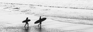
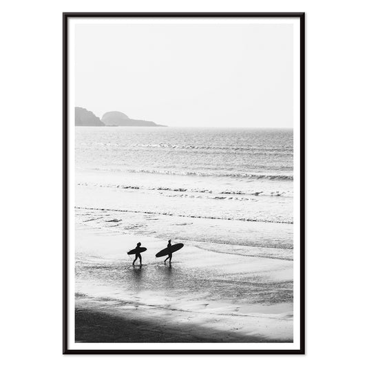
Surfisti che camminano sulla spiaggia Poster
Artista sconosciuto · 1976 · Poster in bianco e nero con surfisti che portano le tavole lungo la riva
Poster da €9 · Incorniciato da €16
Prezzo di listino Da €6,00Prezzo di listino -
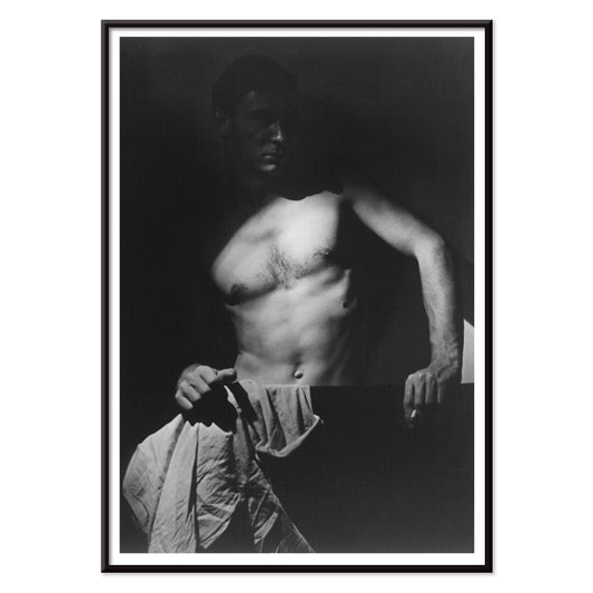
Max After Surfing Poster
Olive Cotton · 1939 · Luminosa stampa d'arte in bianco e nero del torso di un surfista scolpito dalla luce drammatica
Poster da €9 · Incorniciato da €16
Prezzo di listino Da €6,00Prezzo di listino -
Porto Poster
Artista sconosciuto · 2020 · Poster di Porto in bianco e nero con linee nitide e veduta contemplativa dalla finestra
Poster da €9 · Incorniciato da €16
Prezzo di listino Da €6,00Prezzo di listino -
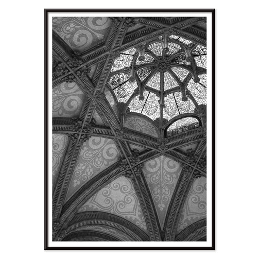
Hospital de la Santa Creu i Sant Pau Poster
Artista sconosciuto · 1901 · poster architettonico monocromo che cattura le volte di Sant Pau con luce e ombra drammatiche
Poster da €9 · Incorniciato da €16
Prezzo di listino Da €6,00Prezzo di listino -
Osen Poster
Komura Settai · 1934 · Poster di pioggia silenziosa con figure sotto ombrelli wagasa in toni d'inchiostro essenziali
Poster da €9 · Incorniciato da €16
Prezzo di listino Da €6,00Prezzo di listino -
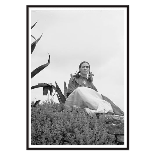
Frida Kahlo in piedi accanto a un'agave Poster
Toni Frissell · 1937 · Iconico poster in bianco e nero di Frida Kahlo in piedi accanto a un agave
Poster da €9 · Incorniciato da €16
Prezzo di listino Da €6,00Prezzo di listino -
Frida Kahlo seduta accanto a un'agave Poster
Toni Frissell · 1937 · Imponente poster in bianco e nero con ritratto di Frida Kahlo seduta accanto a un'agave
Poster da €9 · Incorniciato da €16
Prezzo di listino Da €6,00Prezzo di listino -
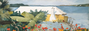
Marchese di Tavistock Poster
Toni Frissell · 1955 · Elegante poster in bianco e nero con coppia che evoca il glamour dei resort di Bermuda anni '50
Poster da €9 · Incorniciato da €16
Prezzo di listino Da €6,00Prezzo di listino -
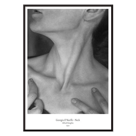
Georgia O'Keeffe - Neck Poster
Alfred Stieglitz · 1921 · Intima stampa d'arte in bianco e nero che ritrae collo e mandibola in astrazione scultorea
Poster da €9 · Incorniciato da €16
Prezzo di listino Da €6,00Prezzo di listino -
Frida Kahlo in piedi accanto a una pianta di agave Poster
Toni Frissell · 1937 · Iconico poster in bianco e nero con Frida Kahlo accanto a un'imponente silhouette d'agave
Poster da €9 · Incorniciato da €16
Prezzo di listino Da €6,00Prezzo di listino -
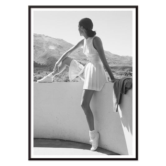
Modella in abito da tennis Poster
Toni Frissell · 1947 · Elegante poster di tennis con modella composta su sfondo montano in bianco e nero
Poster da €9 · Incorniciato da €16
Prezzo di listino Da €6,00Prezzo di listino -
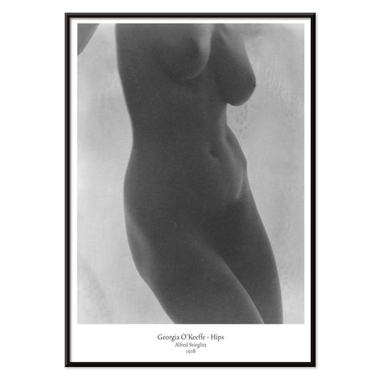
Fianchi di Georgia O'Keeffe Poster
Alfred Stieglitz · 1918 · Intima stampa modernista nuda con ritaglio scultoreo e toni in bianco e nero
Poster da €9 · Incorniciato da €16
Prezzo di listino Da €6,00Prezzo di listino -
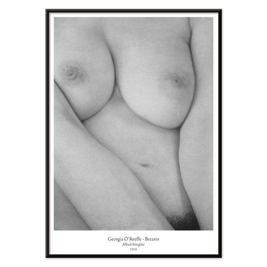
Seni di Georgia O'Keeffe Poster
Alfred Stieglitz · 1919 · Intimo poster in bianco e nero con nudo dalle curve scultoree e luce soffusa
Poster da €9 · Incorniciato da €16
Prezzo di listino Da €6,00Prezzo di listino -
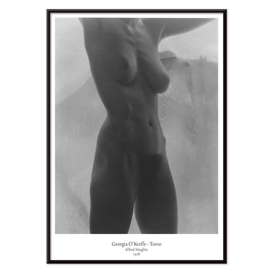
Torso di Georgia O'Keeffe Poster
Alfred Stieglitz · 1918 · Intima stampa d'arte in bianco e nero con torso ritagliato illuminato da luce soffusa
Poster da €9 · Incorniciato da €16
Prezzo di listino Da €6,00Prezzo di listino -
Modelle in costume da bagno Poster
Toni Frissell · 1921 · Elegante stampa d'arte a bordo piscina con silhouette in costume che fluttuano sull'acqua
Poster da €9 · Incorniciato da €16
Prezzo di listino Da €6,00Prezzo di listino -
Nickerson Paine in bikini Poster
Toni Frissell · 1971 · poster in bianco e nero con composizione solare sul mare e contrasti netti
Poster da €9 · Incorniciato da €16
Prezzo di listino Da €6,00Prezzo di listino -
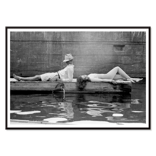
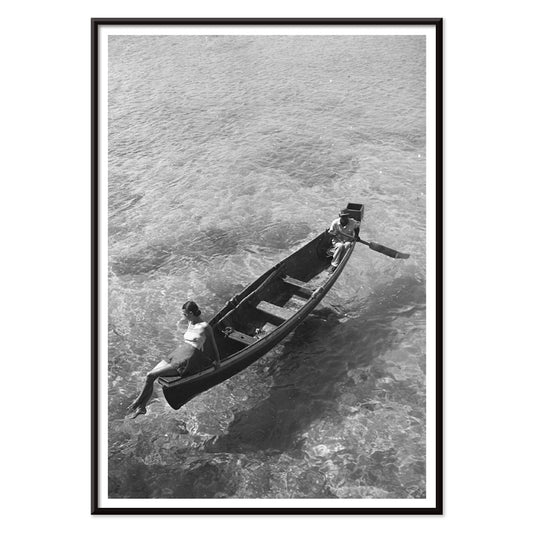
Modella seduta sul bordo di una barca Poster
Toni Frissell · 1946 · Elegante poster in bianco e nero con modella seduta sul bordo di una barca
Poster da €9 · Incorniciato da €16
Prezzo di listino Da €6,00Prezzo di listino -
Modella di moda sott'acqua Poster
Toni Frissell · 1947 · Surreale poster di moda sott'acqua con modella sospesa in luminoso bianco e nero
Poster da €9 · Incorniciato da €16
Prezzo di listino Da €6,00Prezzo di listino -
Sorgente di Weeki Wachee Poster
Toni Frissell · 1947 · Onirico poster subacqueo di moda con figura fluttuante in luminoso bianco e nero
Poster da €9 · Incorniciato da €16
Prezzo di listino Da €6,00Prezzo di listino -
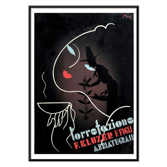
Torrefazione F. Kluzer e Figli Abbiategrasso Poster
Carlo Piquillo Pandolfi · 1930 · Poster Art Deco italiano con tazza di caffè stilizzata e blocchi geometrici di colore
Poster da €9 · Incorniciato da €16
Prezzo di listino Da €6,00Prezzo di listino -
Sigmund Freud aveva ragione Poster
Seymour Chwast · 1970 · Ritratto arguto di Freud in poster con tipografia pop e simboli surreali verdi e arancioni
Poster da €9 · Incorniciato da €16
Prezzo di listino Da €6,00Prezzo di listino -
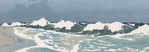
Il pescatore Poster
Henri van der Stok · 1900 · Poster in bianco e nero di un tuffatore nudo tra onde turbolente
Poster da €9 · Incorniciato da €16
Prezzo di listino Da €6,00Prezzo di listino -
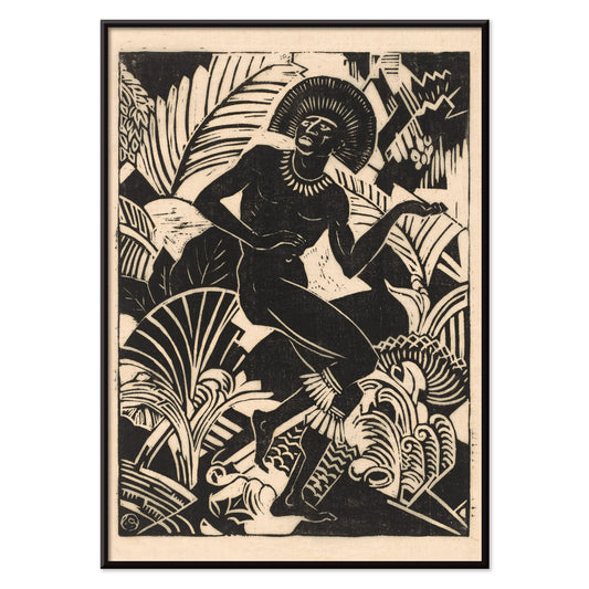
Jager Poster
Henri van der Stok · 1880 · Strepitoso poster in bianco e nero con figura di cacciatore dinamica tra folto fogliame
Poster da €9 · Incorniciato da €16
Prezzo di listino Da €6,00Prezzo di listino -
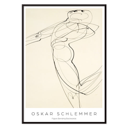
Figura piegata all'indietro Poster
Oskar Schlemmer · 1931 · Stampa d'arte Bauhaus con figura stilizzata piegata in un netto tratto nero
Poster da €9 · Incorniciato da €16
Prezzo di listino Da €6,00Prezzo di listino -
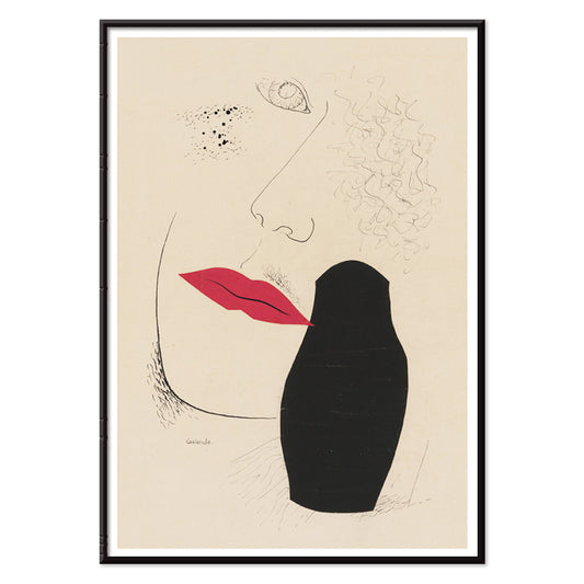
Desire Poster
Mikuláš Galanda · 1927 · Poster modernista con profilo in ombra e labbra rosse vivide su sfondo beige
Poster da €9 · Incorniciato da €16
Prezzo di listino Da €6,00Prezzo di listino -
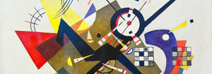
Ohne Titel Poster
Wassily Kandinsky · 1930 · Stampa d'arte geometrica astratta con linee e cerchi sospesi su beige caldo
Poster da €9 · Incorniciato da €16
Prezzo di listino Da €6,00Prezzo di listino -
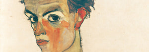
Due amici Poster
Egon Schiele · 1912 · Stampa d'arte intensa e tenera con due nudi intrecciati su carta calda
Poster da €9 · Incorniciato da €16
Prezzo di listino Da €6,00Prezzo di listino -
Bilancia Poster
Henri van der Stok · 1900 · Elegante poster della Bilancia con figura femminile composta e bilance in nero e crema
Poster da €9 · Incorniciato da €16
Prezzo di listino Da €6,00Prezzo di listino -
Scorpius Poster
Henri van der Stok · 1900 · Poster zodiacale vintage di Scorpius con linee nere nitide
Poster da €9 · Incorniciato da €16
Prezzo di listino Da €6,00Prezzo di listino -
Ariete Poster
Henri van der Stok · 1900 · Poster Ariete grafico con silhouette marcata e sfondo stellato
Poster da €9 · Incorniciato da €16
Prezzo di listino Da €6,00Prezzo di listino -
Vergine Poster
Henri van der Stok · 1900 · Poster Art Nouveau della Vergine con figura composta e motivi zodiacali ornamentali
Poster da €9 · Incorniciato da €16
Prezzo di listino Da €6,00Prezzo di listino -
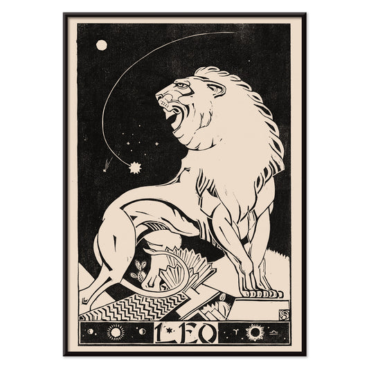
Leone Poster
Henri van der Stok · 1900 · Poster del segno Leone ad alto contrasto con leone ruggente tracciato in linee nere decise
Poster da €9 · Incorniciato da €16
Prezzo di listino Da €6,00Prezzo di listino -
Acquario Poster
Henri van der Stok · 1913 · Poster stilizzato dell'Acquario con grafica nera su fondo beige
Poster da €9 · Incorniciato da €16
Prezzo di listino Da €6,00Prezzo di listino -
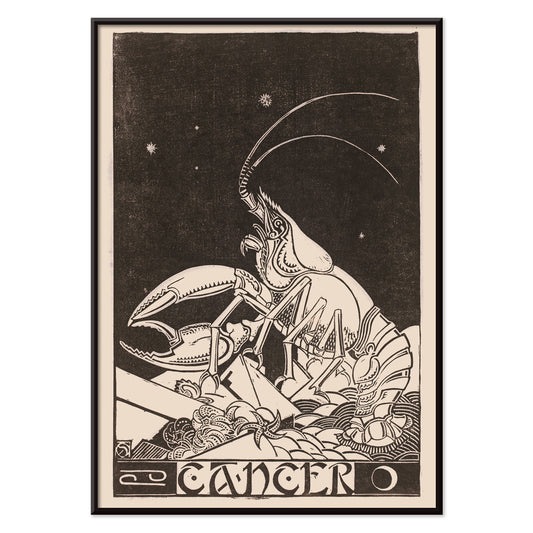
Cancro Poster
Henri van der Stok · 1946 · Onirico poster del Cancro con granchio sotto le stelle in elegante nero su beige
Poster da €9 · Incorniciato da €16
Prezzo di listino Da €6,00Prezzo di listino


- Surfisti a Venice Beach Poster
- Surfisti che camminano sulla spiaggia Poster
- Porto Poster
- Hospital de la Santa Creu i Sant Pau Poster
- Osen Poster
- Frida Kahlo in piedi accanto a un'agave Poster
- Frida Kahlo seduta accanto a un'agave Poster
- Marchese di Tavistock Poster
- Frida Kahlo in piedi accanto a una pianta di agave Poster
- Modella in abito da tennis Poster
- Modelle in costume da bagno Poster
- Nickerson Paine in bikini Poster
- Modella seduta sul bordo di una barca Poster
- Modella di moda sott'acqua Poster
- Sorgente di Weeki Wachee Poster
- Sigmund Freud aveva ragione Poster
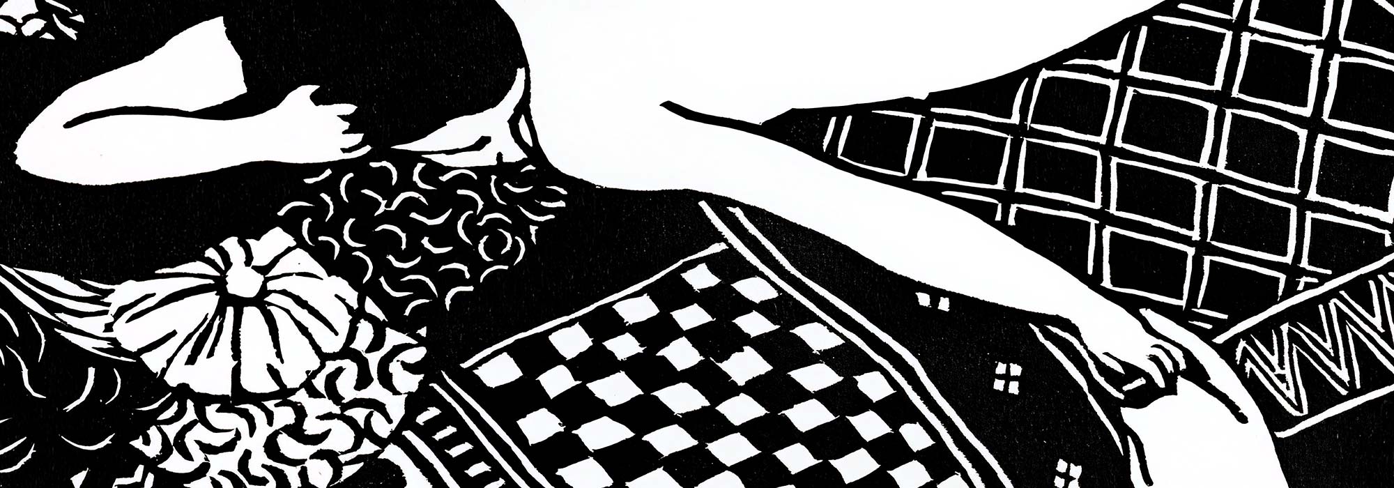
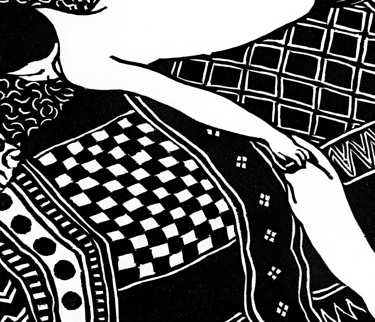
- Due amici Poster
- Bilancia Poster
- Scorpius Poster
- Ariete Poster
- Vergine Poster
- Leone Poster
- Acquario Poster
- Cancro Poster
Inchiostro, argento e il piacere del contrasto
Le immagini in bianco e nero hanno un loro clima: nette, discrete e leggermente cinematografiche. I grigi si spostano come il tempo sulla carta, dalla foschia di carbone al bianco acuto. Qui la cultura del poster vintage incontra la fotografia, le tavole scientifiche e l'astrazione modernista, tenute insieme da valore, linea e spazio negativo. Senza il colore che distragga, il ritmo della stampa diventa più limpido: la scalfittura del pennello, la grana della pellicola, la logica di un diagramma. Questi poster vestono un arredamento che punta su materiali e luce, dove l'arte murale convive con libri, ceramiche e tessuti materici con presenza misurata.
Dall'intimità espressionista alla storia naturale
Il disegno espressionista trasformò il corpo in luogo di candore psicologico, e Egon Schiele spinse quel linguaggio con contorni nervosi e spazi improvvisi, incompiuti. In Due donne che si abbracciano (1913) di Egon Schiele la vicinanza delle figure è esaltata dal bianco circostante, che si comporta come il silenzio in una stanza. Una tradizione diversa emerge nell'illustrazione scientifica, dove la chiarezza è una forma di bellezza. Le tavole di Ernst Haeckel usano simmetria e tratto controllato per rendere la tassonomia leggibile, alimentando al contempo il vocabolario del design dell'epoca. Hexacoralla da Kunstformen der Natur (1904) di Ernst Haeckel si legge sia come biologia marina sia come ornamento, un ponte tra microscopio e decorazione.
Dove funziona meglio l'arte murale monocromatica
Le stampe monocrome eccellono negli spazi di transizione perché il contrasto regge a colpo d'occhio. In un corridoio o su una rampa di scale, i poster in bianco e nero possono scorrere come un racconto continuo; accostare fotografia e diagrammi mantiene lo sguardo in movimento. In studi e cucine la linea tecnica trova posto tra scaffali e utensili, e la cartografia offre pattern senza una palette rumorosa. Nuovo piano di Londra (1853) di J. Whitbread porta una geometria stradale che si comporta quasi come tessuto. Per atmosfere affini, Fotografia punta sul tono, mentre Scienza e Mappe mantengono l'accento sulla struttura.
Curare tra movimenti: Op art, Bauhaus e misura
Poiché il bianco e nero riduce le scelte cromatiche, facilita anche la mescola di epoche. L'Op art sfrutta la meccanica stessa dell'occhio, e Riley Blaze (1964) di Bridget Riley introduce vibrazione e tensione ottica adatte a stanze essenziali e superfici opache. La grafica Bauhaus parla in altro modo: privilegia chiarezza, proporzione e il poster come lingua pubblica moderna. Bauhaus Ausstellung 1923 funziona bene vicino a scaffali in metallo, copertine di vinile e oggetti funzionali, dove la geometria è conversazione più che ornamento. Per equilibrio a inchiostro e asimmetria, Orientale offre un contrappunto utile, mentre Minimalista mantiene il focus sullo spazio negativo.
Inquadrare, accostare e lasciare che la carta conti
L'arte murale monocroma richiede attenzione al tono della carta e ai margini. I bianchi caldi ammorbidiscono stanze con legno e lino; i bianchi freddi accentuano acciaio, vetro e cemento. Parti da un poster deciso sopra una consolle, poi costruisci intorno ripetendo un indizio visivo, come lo spessore della linea o la larghezza del bordo, così una parete galleria resta coerente senza essere uguale. La scelta della cornice è parte della palette: cornici nere intensificano il contrasto, il legno naturale introduce calore attorno ai grigi fotografici. Usa Cornici per mantenere i bordi puliti e coerenti, e considera di mescolare formati con Poster Verticali e Poster Orizzontali per governare il ritmo sulla parete.