


- Distruggi questa bestia folle Poster
- Shaw o ironia Poster
- Les Lalanne Poster
- Punch Boutique Poster
- Giudaismo e Paganesimo Poster
- Jet Clipper per le Hawaii Poster
- Campari Soda Poster
- Bec-Kina Poster
- Scena di strada di Berlino Poster
- Mostra di Ernst Kirchner Poster
- Tour Eiffel 2 Poster
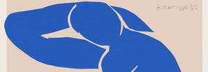
- Donna di spalle Poster
- Park Near Lu Poster
- El Comienzo Poster
- Parler Seul 2 Poster
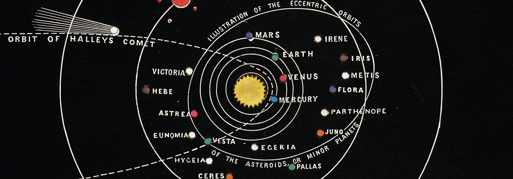
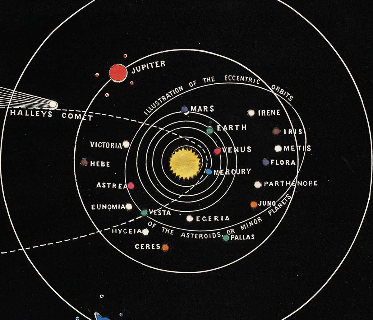
- La posizione attuale dei Mahatmas Poster
- Twilight’s Ring Poster
- Parler Seul Poster
- Il sogno Poster
- Le Concert Poster
- Uccello che attraversa una nuvola Poster
- Artista femminile Poster
- Revenge of the Pink Panther Poster
- Donna e uccello di notte Poster
- Riley Blaze Poster
- Almanacco Poster
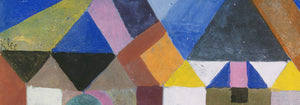
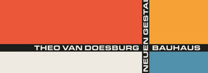
- Bauhaus 20 Poster
- Bauhaus 21 Poster
- Mangia più frutta Poster
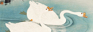
- Gru giapponese blu Poster
- Snoopy Come Home Poster
- Per Londra con Jet Clipper Poster
- La Paresse Poster
- Xerez Pedro Domecq Poster
- Balsam Aperitif Poster
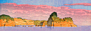
- Crans-sur-Sierre Poster
-
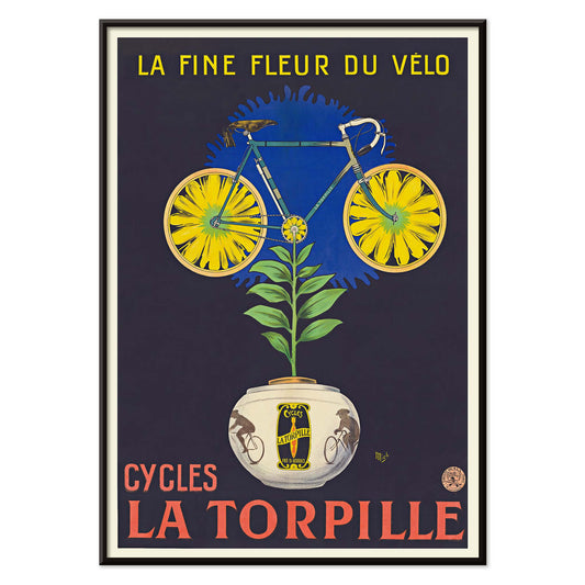
Cycles La Torpille Poster
Michel Liebeaux · 1923 · poster per biciclette con ironia floreale e colori Art Deco decisi
Poster da €9 · Incorniciato da €16
Prezzo di listino Da €6,00Prezzo di listino -
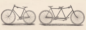
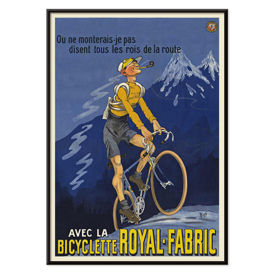
Bicicletta Royal-Fabric Poster
Michel Liebeaux · 1922 · poster vintage di ciclismo con corridore in salita e lettering Royal-Fabric
Poster da €9 · Incorniciato da €16
Prezzo di listino Da €6,00Prezzo di listino -
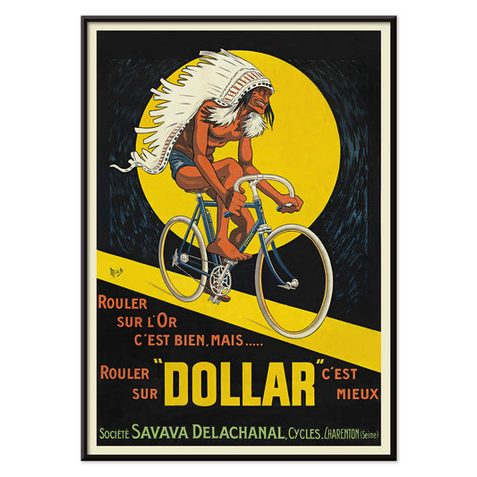
Biciclette Dollar Poster
Michel Liebeaux · 1922 · poster audace con un ciclista lanciato attraverso un cerchio giallo luminoso
Poster da €9 · Incorniciato da €16
Prezzo di listino Da €6,00Prezzo di listino -
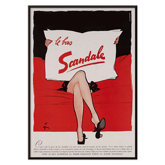
Le bas scandale Poster
Paul Iribe · 1920 · poster vintage in nero, rosso e bianco con un audace messaggio di moda
Poster da €9 · Incorniciato da €16
Prezzo di listino Da €6,00Prezzo di listino -
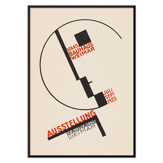
Mostra Bauhaus a Weimar Poster
Dörte Helm · 1923 · poster Bauhaus con geometrie decise e tipografia rossa su fondo beige
Poster da €9 · Incorniciato da €16
Prezzo di listino Da €6,00Prezzo di listino -
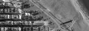
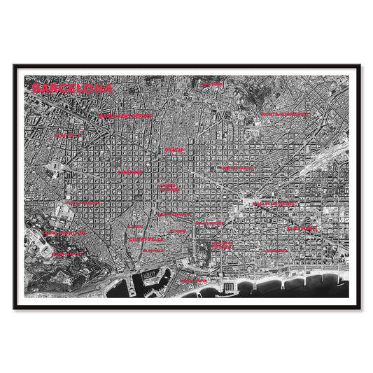
Mappa satellitare di Barcellona Poster
MORYARTY · 2026 · poster con mappa satellitare di Barcellona, etichette rosse e profilo della costa
Poster da €9 · Incorniciato da €16
Prezzo di listino Da €6,00Prezzo di listino -
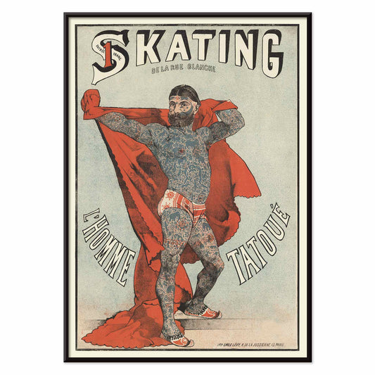
Skating de la Rue Blanche Poster
Émile Lévy · 1879 · stampa d'arte vintage con figura tatuata davanti a un drappo rosso
Poster da €9 · Incorniciato da €16
Prezzo di listino Da €6,00Prezzo di listino -
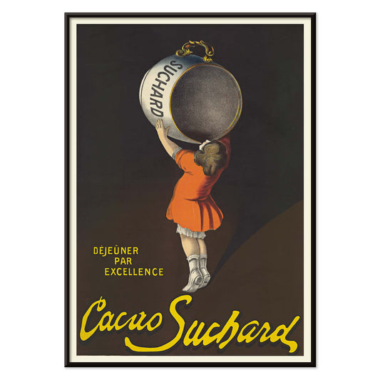
Cacao Suchard Poster
Leonetto Cappiello · 1911 · poster vintage con una scenografica latta Suchard e accenti arancioni
Poster da €9 · Incorniciato da €16
Prezzo di listino Da €6,00Prezzo di listino -
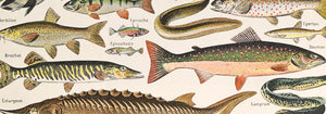
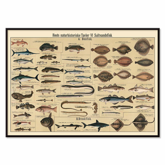
Tavola dei pesci d'acqua salata Poster
Dr. W. Raschke · 1909 · stampa scientifica dettagliata con pesci d'acqua salata su fondo beige caldo
Poster da €9 · Incorniciato da €16
Prezzo di listino Da €6,00Prezzo di listino -
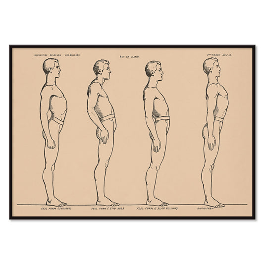
Studio della postura in piedi Poster
N.C. Roms · 1906 · stampa scientifica con quattro studi di postura in piedi su fondo beige
Poster da €9 · Incorniciato da €16
Prezzo di listino Da €6,00Prezzo di listino -
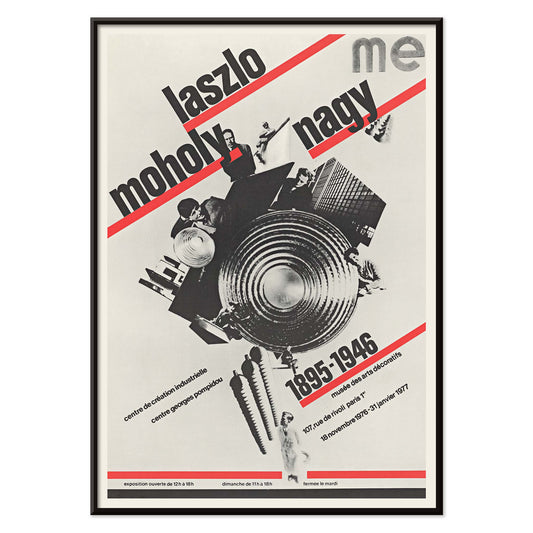
László Moholy-Nagy Poster
Roman Cieślewicz · 1976 · poster Bauhaus con tipografia diagonale decisa e nucleo centrale in collage nero
Poster da €9 · Incorniciato da €16
Prezzo di listino Da €6,00Prezzo di listino -
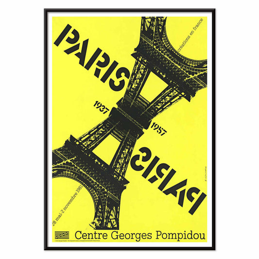
Paris-Paris 1937-1957 Poster
Roman Cieślewicz · 1981 · poster parigino con Torre Eiffel speculare e netto contrasto giallo
Poster da €9 · Incorniciato da €16
Prezzo di listino Da €6,00Prezzo di listino -
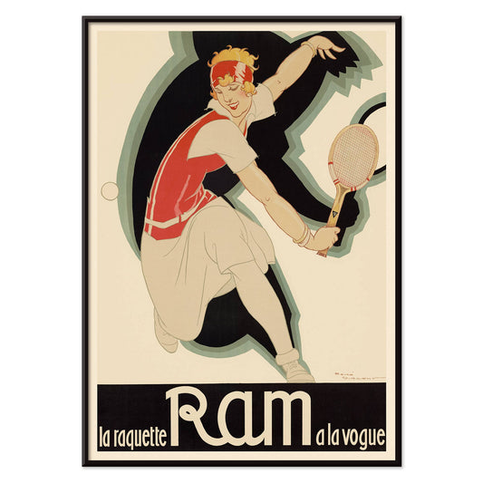
La raquette Ram a la vogue Poster
René Vincent · 1926 · poster vintage con tennista in movimento e grande lettering Ram
Poster da €9 · Incorniciato da €16
Prezzo di listino Da €6,00Prezzo di listino -
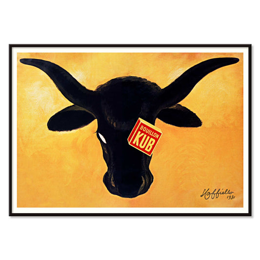
Bouillon Kub Poster
Leonetto Cappiello · 1931 · Poster Bouillon Kub con toro nero su fondo arancione
Poster da €9 · Incorniciato da €16
Prezzo di listino Da €6,00Prezzo di listino -
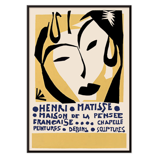
Maison de la Pensée française Poster
Henri Matisse · 1950 · poster di mostra con volto simile a una maschera e lettering blu
Poster da €9 · Incorniciato da €16
Prezzo di listino Da €6,00Prezzo di listino -
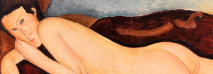
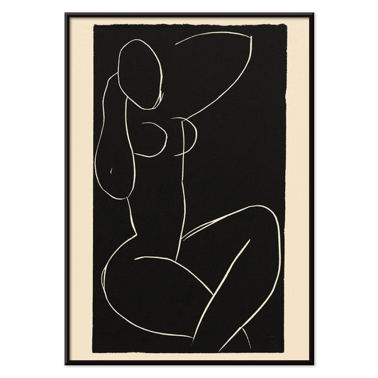
Il pomeriggio Poster
Henri Matisse · 1941 · stampa d'arte minimalista con figura reclinata su fondo nero
Poster da €9 · Incorniciato da €16
Prezzo di listino Da €6,00Prezzo di listino -
Nudo seduto con gambe incrociate I Poster
Henri Matisse · 1941 · stampa d'arte minimalista di un nudo seduto con gambe incrociate
Poster da €9 · Incorniciato da €16
Prezzo di listino Da €6,00Prezzo di listino -
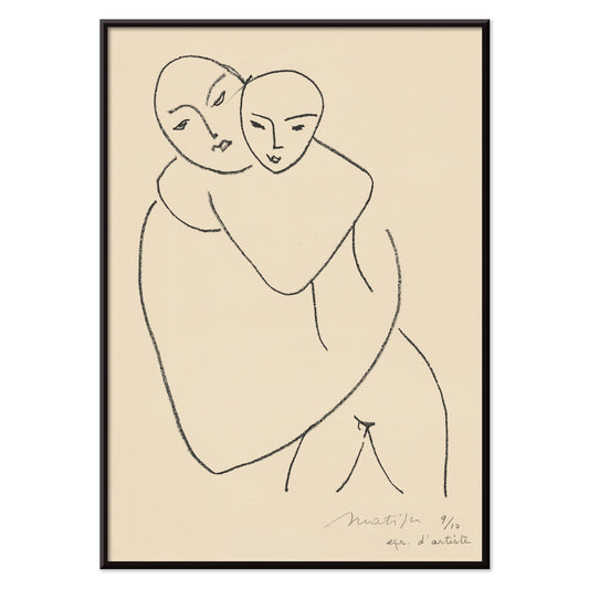
Vierge et enfant Poster
Henri Matisse · 1950 · stampa d'arte minimalista di madre e bambino in essenziali linee nere
Poster da €9 · Incorniciato da €16
Prezzo di listino Da €6,00Prezzo di listino -
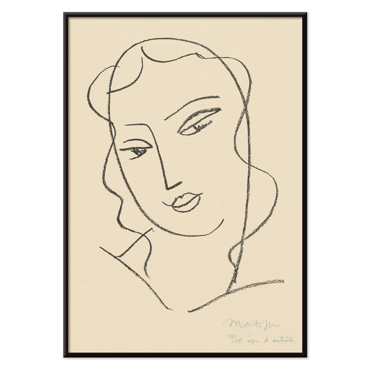
Testa velata Poster
Henri Matisse · 1950 · stampa d'arte essenziale con volto velato e linee nere leggere
Poster da €9 · Incorniciato da €16
Prezzo di listino Da €6,00Prezzo di listino -
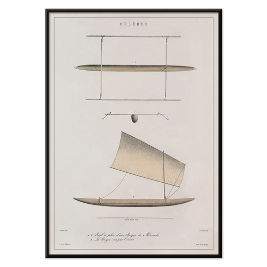
Canoa di Celebes Poster
J. Tastu · 1833 · stampa scientifica con piante di canoa di Celebes in sottili linee nere
Poster da €9 · Incorniciato da €16
Prezzo di listino Da €6,00Prezzo di listino -
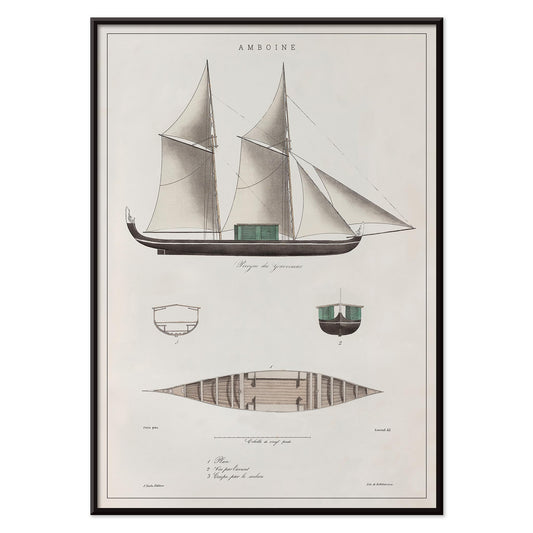
Amboine Poster
J. Tastu · 1833 · Amboine in formato poster verticale, con studio di veliero in beige tenue
Poster da €9 · Incorniciato da €16
Prezzo di listino Da €6,00Prezzo di listino -
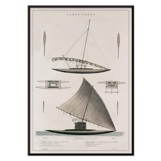
Tonga-Tabou Poster
J. Tastu · 1833 · stampa scientifica precisa con piroghe polinesiane e atmosfera nautica essenziale
Poster da €9 · Incorniciato da €16
Prezzo di listino Da €6,00Prezzo di listino -
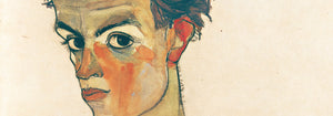
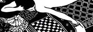
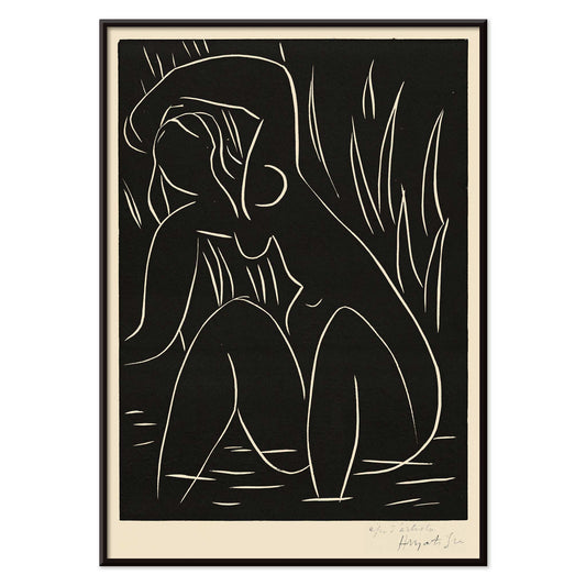
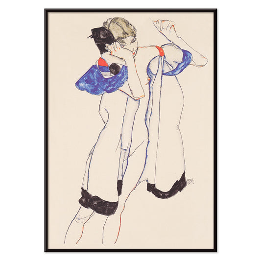
Nudo seduto visto di schiena Poster
Egon Schiele · 1917 · poster vintage con nudo seduto, tracciato da contorni espressivi
Poster da €9 · Incorniciato da €16
Prezzo di listino Da €6,00Prezzo di listino -
Donna in vestaglia Poster
Egon Schiele · 1913 · stampa d'arte espressiva con figura in vestaglia tra blu, nero e beige
Poster da €9 · Incorniciato da €16
Prezzo di listino Da €6,00Prezzo di listino -
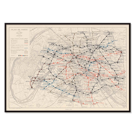
Plan de Paris et du chemin de fer métropolitain Poster
Louis Wuhrer · 1912 · poster del Métro di Parigi con percorsi minuti e mappa urbana storica
Poster da €9 · Incorniciato da €16
Prezzo di listino Da €6,00Prezzo di listino -
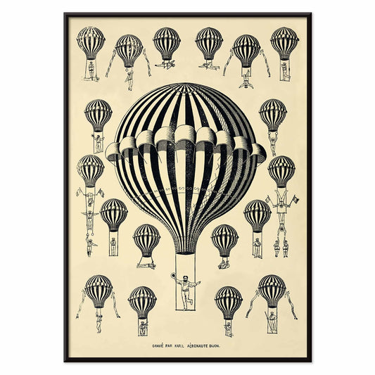
Studio di mongolfiere Poster
Henry de La Vaulx · 1876 · poster vintage con mongolfiere a righe in forma di stampa scientifica
Poster da €9 · Incorniciato da €16
Prezzo di listino Da €6,00Prezzo di listino -
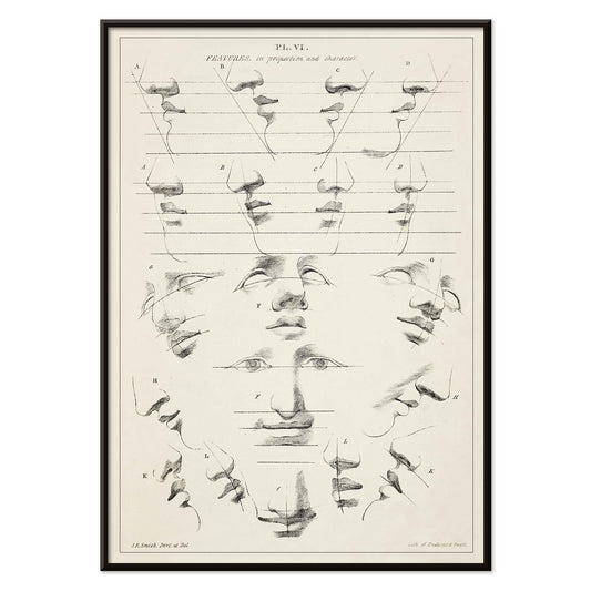
Chiave dell'arte di disegnare la figura umana Poster
John Rubens Smith · 1831 · stampa d'arte di studio della figura con linea nera precisa
Poster da €9 · Incorniciato da €16
Prezzo di listino Da €6,00Prezzo di listino


27/819 items
- No bestsellers in this collection
Nero come struttura nel design dei poster vintage
Il nero spesso funziona meno come colore e più come cornice. Nel design dei poster vintage affila i contorni, stabilizza l'ornamento e concede respiro al colore. Questa collezione Nero riunisce poster in cui l'oscurità appare come inchiostro, silhouette, cielo notturno o spina tipografica, un filtro editoriale più che una regola monocroma. È un filo utile per arte murale e decorazione, soprattutto quando vuoi che una stanza appaia composta senza risultare severa. Abbina queste stampe a materiali che hanno già una nota scura, come ferramenta in ferro, una base lampada opaca o un tessuto carbone, e il resto della palette apparirà più intenzionale.
Come gli artisti hanno usato il nero per tenere insieme l'immagine
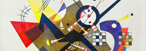
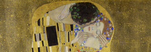
In Il Bacio (1907–1908) di Gustav Klimt, il nero funziona come velluto dietro l'oro, facendo sembrare la superficie illuminata dall'interno e mantenendo leggibile l'ornamento. La Tournée du Chat Noir (1896) di Théophile Alexandre Steinlen trasforma un campo di mezzanotte piatto in teatro, dimostrando come la silhouette possa portare carattere e umorismo con quasi nessun modellato. L'equilibrio modernista emerge in Cerchi in un cerchio (1923) di Wassily Kandinsky, dove le linee nere agiscono da impalcatura per colore e movimento. Perfino la bravura pubblicitaria dipende dall'oscurità: Vermouth Martini (1920) di Leonetto Cappiello usa ombre profonde per far risaltare il giallo agrumato e i toni della pelle, un trucco classico del poster per leggibilità immediata.
Posizionare arte murale con accenti neri nell'arredamento
Perché il nero legge come struttura, queste scelte di poster si adattano a spazi che beneficiano di ordine visivo: ingressi, cucine e angoli di lavoro. Su pareti chiare le stampe con accento nero risultano nitide e architettoniche; su pitture sature creano tensione e profondità. In camera da letto un contorno o un bordo scuro può calmare una palette vivace, mentre in sala da pranzo si comporta come una giacca su misura, offrendo a candele e ceramiche un palcoscenico più chiaro. Per compagni in alto contrasto vedi Bianco e Nero; per composizioni contenute, Minimalista mantiene il ritmo pulito. Se preferisci la carica grafica d'epoca, Pubblicità aggiunge lettering audace e giochi figura-sfondo drammatici.
Curare abbinamenti, soggetti e cornici
Su una parete galleria mista lascia che il nero sia la nota ricorrente: un poster grafico, una tavola figurativa, una stampa astratta. Un foglio naturalistico come la Testa di tigre (1911) di Abbott Handerson Thayer porta tratti densi e pelliccia in ombra che si sposano naturalmente con ottone, pelle e legno scuro. Per spaziatura misurata e disciplina tipografica, inserisci geometrie da Bauhaus; per soggetti naturali, Animali mantiene l'immagine coerente lasciando ricorrere il segno nero. Se vuoi un registro più simbolico, Esoterico introduce bordi da tarocchi, stelle e diagrammi che richiamano la cultura delle linee scientifiche. La scelta della cornice conta: frassino nero o noce sottile possono rispecchiare l'inchiostro senza appesantire la stanza, mentre un passepartout bianco generoso aggiunge aria attorno a contorni intricati e piccoli testi.
Un accento scuro che resta flessibile
I dettagli neri sono spesso ciò che resta nella memoria: il profilo di un gatto, una griglia modernista, il sottile bordo intorno a un'etichetta. Tratta questa collezione come uno strumento di decorazione: scegli una stampa vintage per ancorare una stanza e lascia che colore, texture e luce evolvano intorno a essa nel tempo. Quando il nero è usato come nota finale più che come dichiarazione, i poster smettono di essere pura nostalgia d'epoca e diventano design con sguardo lucido.