


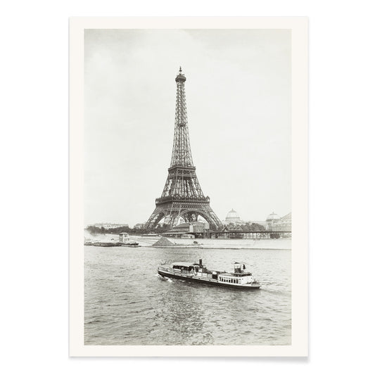
- Tour Eiffel 2 Poster
- Zug Schleife Poster
- Manhattan Poster
- Tokyo Night Poster
- 25th of April Bridge Poster
- Lisbon Bridge Poster
- Surfer in Portugal Poster
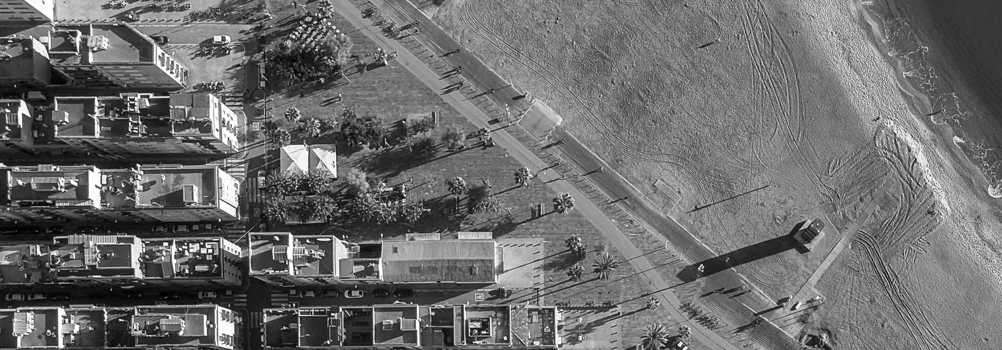
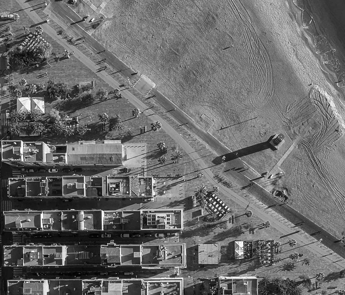
- Lisbon Tramway 28 Poster
- Alfama Poster
- Lisbon Old City 1 Poster
- Lisbon Old City 2 Poster
- Sails Poster
- Air Force Parachuter Poster
- Mitre Peak Poster
- Le mont Paitju Poster
- Le Siniolchu Poster
- Aiguille calcaire Poster
- Staircase Poster
- Le pic K2 Poster
- Broad Peak Poster
- Cape Saint George Lighthouse 2 Poster
- Cape Saint George Lighthouse Poster
- Acrobatics at the beach Poster
-
CST-100 crew capsule Poster
NASA · 2012 · Retro-futurist space capsule poster showing parachute descent over a desert landing zone
Poster from €9 · Framed from €16
Regular price From €6,00Regular price -
Rebecca Salsbury Strand Poster
Alfred Stieglitz · 1922 · Intimate black and white portrait art print with quiet modernist intensity
Poster from €9 · Framed from €16
Regular price From €6,00Regular price -
Margined Pyramidal Saxifrage Poster
Karl Blossfeldt · 1928 · Sculptural saxifrage art print in crisp black and white with architectural symmetry
Poster from €9 · Framed from €16
Regular price From €6,00Regular price -
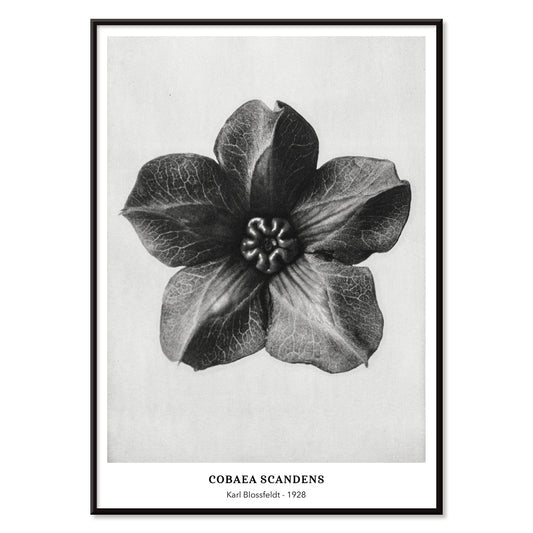
Cobea scandens Poster
Karl Blossfeldt · 1928 · Sculptural Mexican ivy print with crisp monochrome stems and curling tendrils
Poster from €9 · Framed from €16
Regular price From €6,00Regular price -
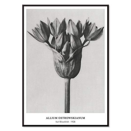
Allium Ostroroskianum Poster
Karl Blossfeldt · 1928 · Modernist botanical print revealing Allium structure in crisp black-and-white detail
Poster from €9 · Framed from €16
Regular price From €6,00Regular price -
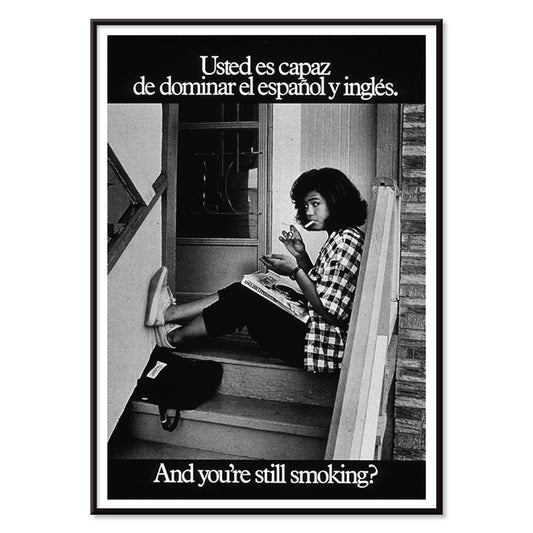
And you're still smoking ? Poster
U.S. Department of Health & Human Services · 1977 · Bilingual anti-smoking poster with bold typography and a monochrome photo of a young woman
Poster from €9 · Framed from €16
Regular price From €6,00Regular price -
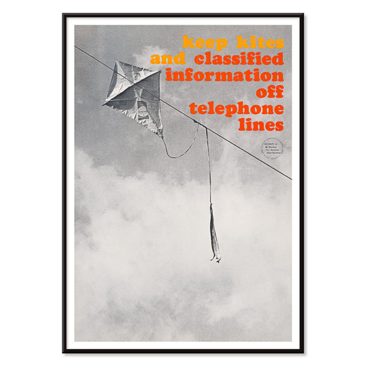
Off telephone lines Poster
Unknown artist · 1964 · Bold safety poster featuring a kite tangled on telephone lines in black and white
Poster from €9 · Framed from €16
Regular price From €6,00Regular price -
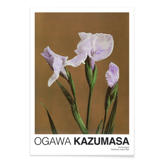
Iris Kæmpferi Poster
Ogawa Kazumasa · 1896 · Hand-colored iris botanical print with slender green leaves and soft purple petals
Poster from €9 · Framed from €16
Regular price From €6,00Regular price -
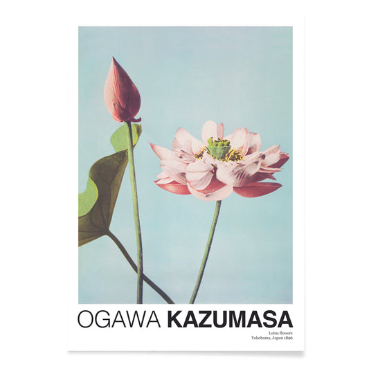
Lotus Flowers Poster
Ogawa Kazumasa · 1892 · Serene lotus flower print blending soft pink blooms with calm blue water
Poster from €9 · Framed from €16
Regular price From €6,00Regular price -
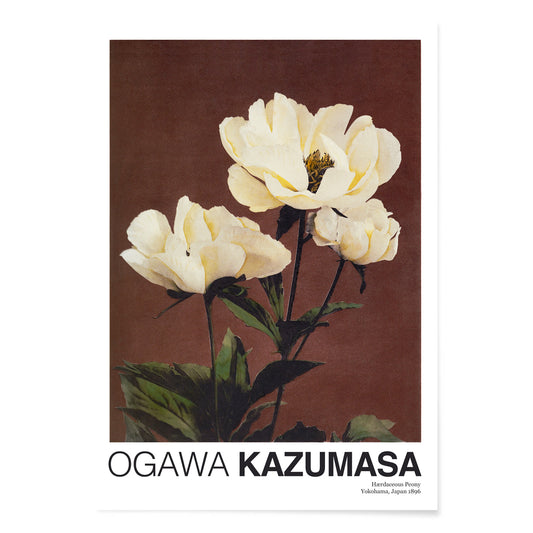
Hærdaceous Peony Poster
Ogawa Kazumasa · 1896 · Serene botanical print of white peony blossoms with deep green leaves on cream
Poster from €9 · Framed from €16
Regular price From €6,00Regular price -
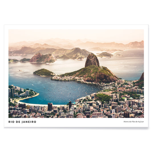
Rio de Janeiro Poster
Agnieszka Ciesielska · 2019 · Vintage inspired Rio de Janeiro poster with Sugarloaf silhouette, sweeping beaches, and boats
Poster from €9 · Framed from €16
Regular price From €6,00Regular price -
Red and white flowers Poster
Emily Van Engel · 2015 · Overhead floral art print pairing red blossoms with crisp white petals and leaves
Poster from €9 · Framed from €16
Regular price From €6,00Regular price -
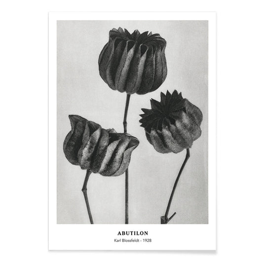
Abutilon Poster
Karl Blossfeldt · 1928 · Sculptural Abutilon pod print revealing ribbed geometry in luminous grayscale
Poster from €9 · Framed from €16
Regular price From €6,00Regular price -
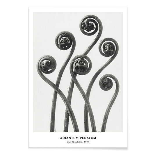
Adiantum pedatum Poster
Karl Blossfeldt · 1928 · High-contrast fern print revealing sculptural leaf geometry in a refined photographic study
Poster from €9 · Framed from €16
Regular price From €6,00Regular price -
Polystichum Munitum Poster
Karl Blossfeldt · 1928 · High-contrast fern print revealing sculptural fronds and crisp botanical geometry
Poster from €9 · Framed from €16
Regular price From €6,00Regular price -
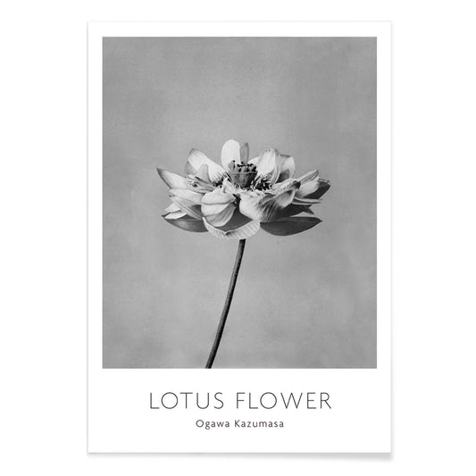
Monochrome lotus flower Poster
Ogawa Kazumasa · 1896 · Serene lotus art print with glowing petals set against soft monochrome tones
Poster from €9 · Framed from €16
Regular price From €6,00Regular price -
The Bronze Buddha at Kamakura Poster
Kazumasa Ogawa · 1897 · Serene hand-colored photo poster of the Kamakura Great Buddha framed by greenery
Poster from €9 · Framed from €16
Regular price From €6,00Regular price -
Eiffel Tower Poster
Henri Rousseau · 1900 · Dreamlike Eiffel Tower poster with calm Paris skyline and soft tonal contrast
Poster from €9 · Framed from €16
Regular price From €6,00Regular price -
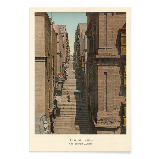
Strada Reale Poster
Photochrom Zürich · 1890 · Sunlit Valletta street poster with stone stairways, balconies, and bustling pedestrians
Poster from €9 · Framed from €16
Regular price From €6,00Regular price -
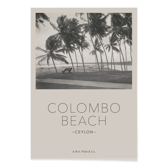
Colombo Beach in Ceylon Poster
Adolphus William Albert Plâté · 1940 · Serene Colombo beach poster with palm silhouettes and a quiet bench facing the sea
Poster from €9 · Framed from €16
Regular price From €6,00Regular price -
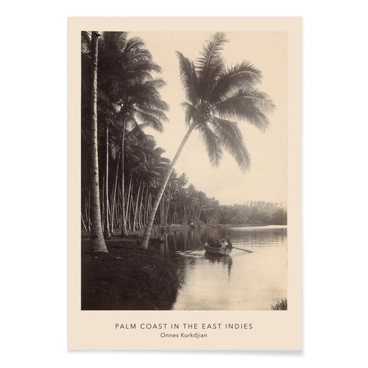
Palm Coast Poster
Onnes Kurkdjian · 1895 · Tropical coastline poster with tall palms and calm water in muted beige tones
Poster from €9 · Framed from €16
Regular price From €6,00Regular price -
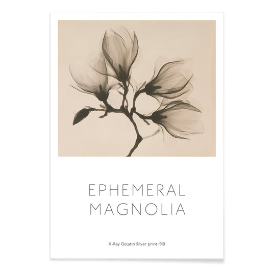
Magnolia Branch Poster
Kazutoshi Sugiura · 1864 · High-contrast magnolia botanical print with four blossoms floating against deep black
Poster from €9 · Framed from €16
Regular price From €6,00Regular price


22/130 items
- CST-100 crew capsule Poster
- Rebecca Salsbury Strand Poster
- Margined Pyramidal Saxifrage Poster
- Cobea scandens Poster
- Allium Ostroroskianum Poster
- And you're still smoking ? Poster
- Off telephone lines Poster
- Lotus Flowers Poster
- Rio de Janeiro Poster
- Abutilon Poster
- Adiantum pedatum Poster
- Polystichum Munitum Poster
A century of captured light
Photography has always been a way of making time visible: a street corner held still, a face caught between gestures, a horizon reduced to tone and line. This collection gathers vintage poster images that move from early expedition plates to mid-century reportage and NASA documentation, united by decisive cropping and a preference for atmosphere over spectacle. Some sit naturally beside the graphic restraint of Black & White wall art; others lean toward travel notes and topographic calm, where a photograph can feel as measured as Maps. As decoration, these prints behave like windows: cool, observational, and quietly narrative.
Processes, archives, and photographic modernity
Many of the visual signatures people associate with vintage photography come from process as much as subject. Silver-gelatin printing sharpened edges and deepened blacks; collotype and early photomechanical methods softened transitions and invited hand-coloring; magazine halftones encouraged bolder contrast for legibility at a glance. That technical history shaped modern design language, influencing everything from editorial layouts to the pared-back grids later echoed in Bauhaus graphics and the disciplined reduction of Minimalist prints. Even when the scene is documentary, the photograph is constructed: perspective corrected, shadows managed, and surfaces allowed to speak through grain.
Artworks that show how photographs compose a room
In Tour Eiffel, Paris, black and white, the iron lattice reads as pattern and rhythm, turning architecture into near-abstraction. Vittorio Sella’s Le pic K2, glacier view, 1909 expands the scale: snowfields and rock faces stack into bands of tone that feel almost engraved, a natural bridge to Landscape posters. Karl Blossfeldt’s Margined Pyramidal Saxifrage, enlarged leaf, 1928 brings the studio close, turning plant structure into sculpture, and it pairs beautifully with Botanical wall art when you want repetition and detail to carry a space.
Interior placement, color, and materials
Photographic wall art works best where you want depth without visual noise. In an entryway, a city image gives direction and pace; in a bedroom, close botanical forms soften hard furniture lines and keep the mood quiet. Rooms built from linen, oak, walnut, or matte plaster can handle higher contrast, while coastal palettes often prefer midtones and open skies, especially alongside Sea & Ocean prints. For kitchens and dining areas, look for structural rhythm: blossoms, staircases, bridges, and steelwork echo ceramics, cookware, and tile joints, making the photograph feel like another material in the room.
Curating, framing, and sequences
A strong gallery wall is less about matching subjects than keeping a shared tempo. Pair one architectural anchor with two intimate studies, letting scale shift from distant to close. Hold a consistent frame finish for contemporary clarity, or vary widths for an archival mood while keeping margins aligned. The orbital perspective of Earth from the ISS cupola, 2015 works with alpine scenes because both rely on negative space and measurement, and it can also nod toward the wider Space collection when you want a sharper scientific accent. When the sequence moves from street-level detail to planetary distance, the decoration starts to read like a personal archive.