


You may also like
-
Montagne Poster
James Reynolds · 1851 · Stampa vintage didattica delle altezze montane con silhouette etichettate in panorama suggestivo
Poster da €9 · Incorniciato da €16
Prezzo di listino Da €6,00Prezzo di listino -
Vulcani e Terremoti Poster
James Reynolds · 1849 · Dettagliata stampa vintage con mappa mondiale che segnala fasce vulcaniche e zone sismiche
Poster da €9 · Incorniciato da €16
Prezzo di listino Da €6,00Prezzo di listino -
Mappa fisica di Parigi Poster
James Reynolds · 1850 · Dettagliata mappa fisica di Parigi in stampa vintage con rilievo sfumato e toponimi nitidi
Poster da €9 · Incorniciato da €16
Prezzo di listino Da €6,00Prezzo di listino -
Carta geologica del mondo Poster
James Reynolds · 1850 · Stampa vintage dettagliata della geologia mondiale con stratigrafie colorate e etichette vittoriane
Poster da €9 · Incorniciato da €16
Prezzo di listino Da €6,00Prezzo di listino


-

"Very nice Posters. The quality is amazing and we received it very quickly !"
-

"A shop to visit absolutely. Huge selection of posters. We spent more than an hour there !"
-

"Perfect to find gift. Price are very good. An they can frame and pack it on site"


L'artista
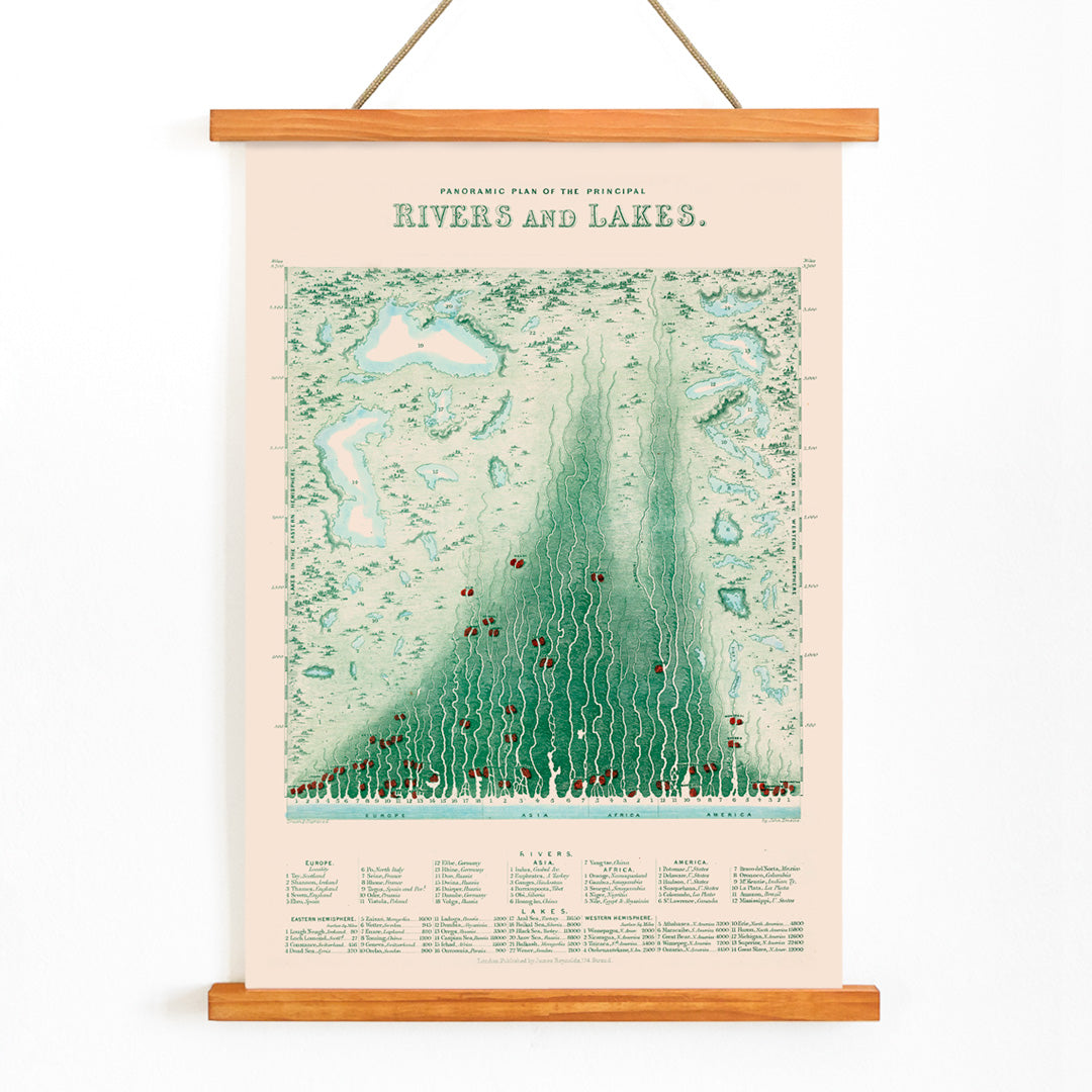
James Reynolds fu un importante editore e cartografo britannico dell'epoca vittoriana, periodo in cui l'educazione visiva fiorì e la conoscenza geografica divenne sempre più accessibile al pubblico. Le sue pubblicazioni, inclusa questa tavola del 1851, rispecchiano la fascinazione dell'epoca per i dati comparativi e la volontà di rendere informazioni complesse immediatamente comprensibili. Le mappe e i grafici di Reynolds venivano largamente impiegati nelle scuole e nelle collezioni private, apprezzati per la chiarezza e l'approccio innovativo alla rappresentazione del mondo.
Il suo lascito vive nel campo del design dell'informazione: l'equilibrio tra precisione ed eleganza nelle sue tavole continua a ispirare collezionisti e appassionati dell'arte educativa del XIX secolo.
L'opera
Datata 1851, questa tavola comparativa di fiumi e laghi incarna l'appetito vittoriano per la conoscenza e lo spirito inventivo nel presentare informazioni globali. In un'epoca di esplorazioni e rilievi scientifici in rapida espansione, stampe di riferimento come questa offrivano al pubblico la possibilità di confrontare corsi d'acqua e bacini interni fianco a fianco. L'opera è pensata per suscitare curiosità e conversazione, rendendo luoghi lontani tangibili e comprensibili senza la necessità di un atlante completo.
Rappresenta inoltre un documento delle pratiche educative del periodo e del crescente ruolo degli ausili visivi nell'insegnamento e nello studio privato, inserendosi con naturalezza nelle collezioni di mappe come arte murale.
Stile e caratteristiche
La stampa presenta un formato orizzontale ampio, con linee finemente tracciate e fiumi e laghi chiaramente etichettati, rappresentati ciascuno in scala per facilitarne il confronto. I fiumi sono resi come nastri allungati che attraversano la pagina, mentre i laghi appaiono come sagome proporzionate. La palette è sobria: uno sfondo beige caldo accompagnato da delicati accenti in blu, verde e rosso che distinguono categorie diverse e ne migliorano la leggibilità.
Questo approccio infografico d'epoca crea un senso di ordine e chiarezza, con una tipografia nitida e spaziature equilibrate. Il tono complessivo è insieme didattico e accogliente, perfetto per chi è attratto da poster educativi vintage dal gusto raffinato.
Nell'arredamento d'interni
Questa stampa vintage conferisce curiosità e sofisticazione a studi, biblioteche o uffici domestici, dove il suo design dettagliato invita a un'osservazione ravvicinata. Il formato panoramico è ideale sopra scrivanie, consolle o divani e si abbina armoniosamente ad altri poster orizzontali per una parete in galleria bilanciata.
Si presta a una cornice in legno scuro o in ottone che ne richiami il carattere storico; i toni beige e blu possono essere valorizzati con tessili o ceramiche coordinate. Si integra altresì con la selezione di arte murale a tema scientifico per un ambiente d'ispirazione intellettuale e coerente.