


- No bestsellers in this collection
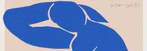
- Rythme n°2 Poster
- Rolling Paper Job Poster
- The new Shasta Daylight Poster
- Champagne Joseph Perrier Poster
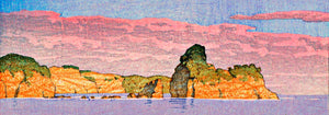
- Takai Poster
- Jardin De Paris Poster
- Off telephone lines Poster
- And you're still smoking ? Poster
- Le Lac d’Annecy Poster
- Phébus Poster
- Vermouth Martini Poster
- La Grande Roue Poster
- Fly to South Sea isles via Pan American Poster
- Playas de Andalucia Poster
- Color Patchwork Poster
- Farbstudien, 10 Blätter I Poster
- Farbstudien, 10 Blätter X Poster
- Farbstudien, 10 Blätter III Poster
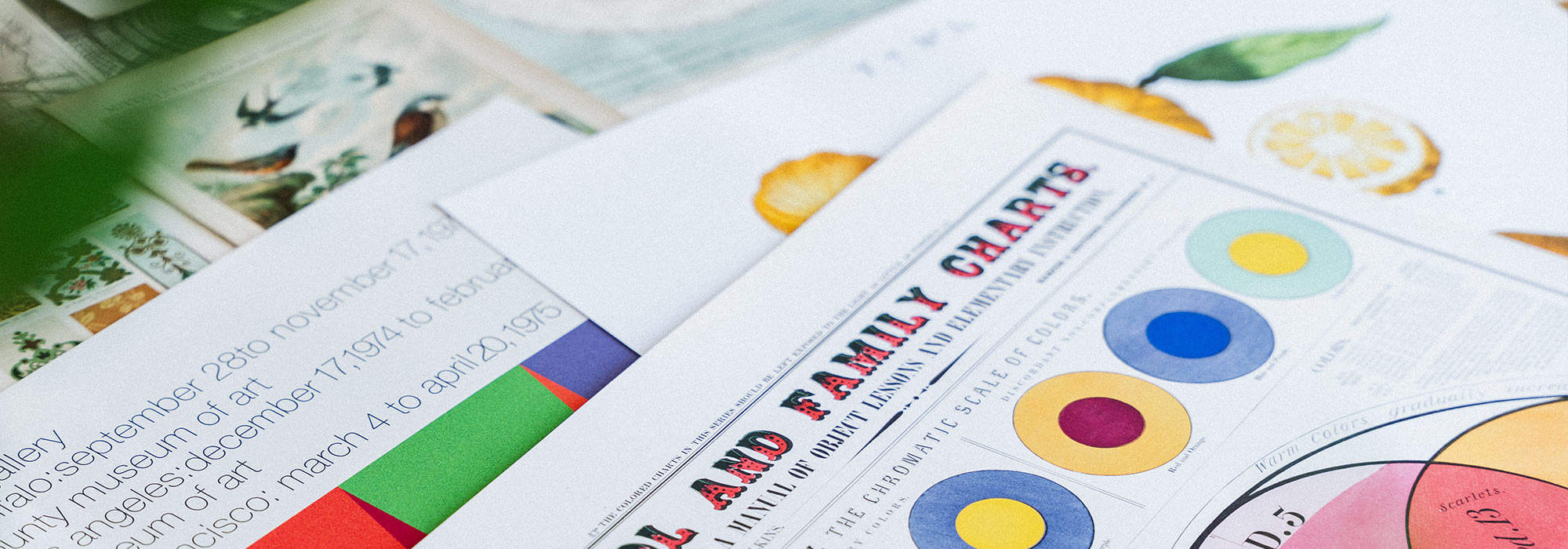
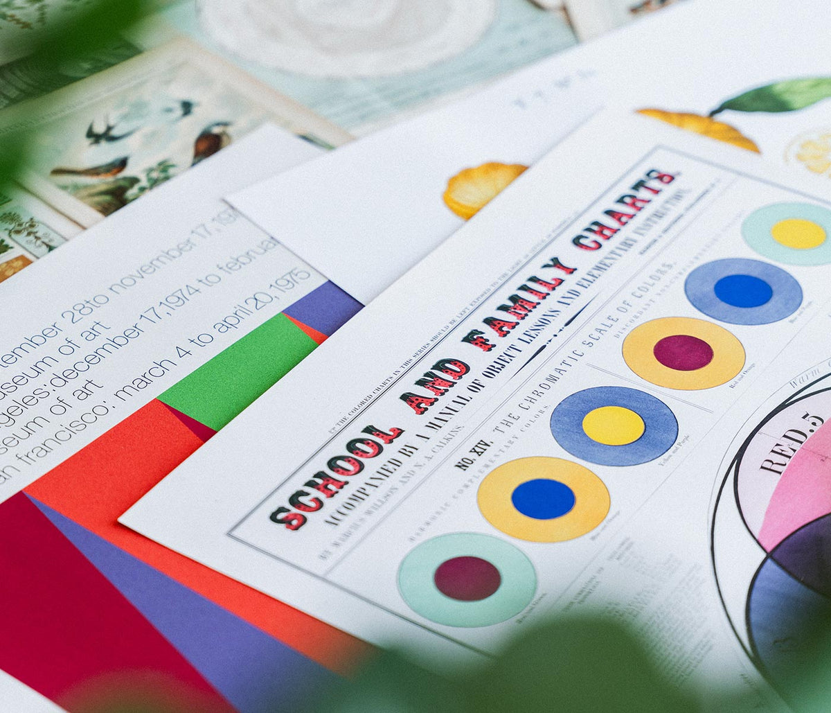
- Historic Ornament Poster
- Carmine Wash Poster
- Farbstudien, 10 Blätter IV Poster
- Citrus Limonium Poster
- Komposition Poster
- Red, Blue, Green Poster
- Area Broken by Perpendiculars Poster
- Different strokes for different folks Poster
- Kandinsky 1941 Poster
- The Ten Largest No. 8 Poster
- Altarpiece No. 1 Poster
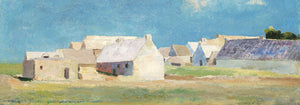
- Genua Poster
- Antibes Poster
- Centre Pure Colors Poster
- Deep Space Atomic Clock Poster
- Fragments de figure Poster
- The Ten Largest No. 3 Poster
- Doves No. 2 Poster
- Allium Ostroroskianum Poster
- Cobea scandens Poster
- Margined Pyramidal Saxifrage Poster
- Mapamundi Poster
- Peaches Poster
- Mapamundi 2 Poster
- The Dove, No. 1 Poster
- Childhood Group IV Poster
- The Ten Largest, No. 6 Poster
- The Ten Largest, No. 9, Old Age Poster
- Vivaudous Mavis Poster
- Rebecca Salsbury Strand Poster
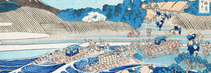
- View of Fuji from the Coast of Kiyomigata Poster
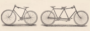
- Rudge Poster
- Cycles Gladiator Poster
- Cycles Perfecta Poster
- Cycles Terrot Dijon 2 Poster
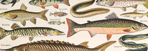
- Leptomedusae Poster
- Discomedusae Poster
- Plankton I Poster
- Cactus cochenillifer Poster
- Orange Trees And Gate Poster
- Sailing off Gloucester Poster
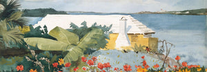
- Flower Garden and Bungalow Poster
- Palm Tree, Nassau Poster
- Gertrude Poster
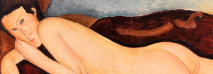
- Squatting Female Nude Poster
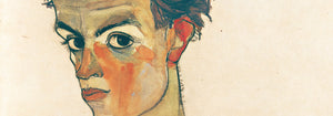
- Self-Portrait with Striped Shirt Poster
- CST-100 crew capsule Poster
- Apollo 9 spacecraft Poster
- Soyuz MS-02 spacecraft Poster
- Soyuz TMA-14M spacecraft Poster
- Soyuz MS-02 spacecraft Poster
- Geikie Plateau Poster
- Hundreds of thousands of stars Poster
- The Earth view from the ISS Poster
- The Moon Poster
- Spectral Analysis Poster
- Smilacina stellata Poster
- Blue stars Poster
- Orange bulbous lily Poster
- Twistedstalk Poster
- Whorled Solomon Poster
- King Solomon Poster
- Loquats (Eriobotrya Japonica) Poster
- Avocado (Persea) Poster
- Bael (Aegle Marmelos) Poster
- Lemons (Citrus Limon) Poster
- Avocado (Persea) Poster
- Persimmons Poster
- Plankton II Poster
- Jellyfish Poster
- Swimming Polyps Poster
- Plaster Hand Poster
- On the beach at Grado Poster
- West Coast of Jutland Poster
- Summertime Poster
- La Vasque Poster
- Boys in a Dory Poster
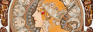
- Heian meishō Pl.09 Poster
- Falbalas et fanfreluches: La paresse Poster
- Three Boys in a Dory with Lobster Pots Poster
- Elegante Pres D’une Source Poster
- Sagittarius Poster
- Pisces Poster
- Capricornus Poster
- Gemini Poster
- Cancer Poster
- Aquarius Poster
- Cigarrillos Paris Poster
- Bicycle Clément Poster
- Chocolat Idéal Poster
- Riz Abadie Poster
- A woman holds flowers Poster
- Pneu Michelin Poster
- Redoute Des Étudiants Poster
- Manufacture Royale De Corsets Poster
- Job Paper Poster
- Fumar El Papel Job O Dejar De Fumar Poster
- Leo Poster
- Virgo Poster
- Aries Poster
- Scorpius Poster
- Libra Poster
- Two Friends Poster
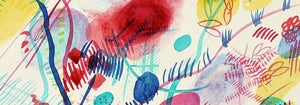
- Gewebe Poster
- Fröhlicher Aufstieg Poster
- Lyrisches Poster
- Klänge Pl.19 Poster
- Kleines Warm Poster
- 11 tableux et 7 poèmes Poster
- Composition Poster
- Composition Poster
- Composition Poster
- Lignes géométriques et ondoyantes Poster
- Warsaw Evenings Poster
- Abstract Nude Poster
- At the Amalfi coast Poster
- Composition in red, blue, green and yellow Poster
- Moa Poster
- Tōkaidō kanaya no fuji Poster
- Head by head Poster
- Ushibori Poster
- Asakusa Kinryuzan Temple Poster
- The Kiso Gorge in Snow Poster
- Barbette Poster
- The boat train Poster
- Ocean Life Poster
- City of New York municipal airports Poster
- Schiele-Ausstellung in der Galerie Arnot Poster
- Sigmund Freud had it Poster
- The modern poster Poster
- Hawaii by flying clipper Poster
A Fresh Shelf for Vintage Seeing
The Latest Posters collection is being prepared as a living edit: a place where newly sourced imagery can arrive with its own accent, period, and temperament. Rather than one movement, it follows the pleasure of discovery, from exhibition graphics and travel advertising to botanical plates, modernist geometry, photographic studies, and classic art reproductions. What unites the future selection is not sameness, but the particular energy of a poster or print that feels ready to enter contemporary wall art and decoration without losing its vintage pulse.
Why Newness Matters in Old Paper
Vintage collecting is often about timing. A lithograph may surface because a theatre closed, a private archive changed hands, or a forgotten publisher's stock was rediscovered. Each arrival carries clues: softened inks, confident lettering, unusual cropping, or the practical genius of an image designed to be understood from across a street. As this collection grows, it will sit naturally beside all posters while giving returning visitors a concise view of what has just joined the catalogue.
Reading Styles Across Eras
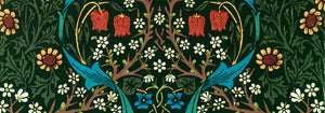
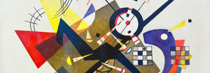
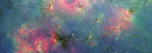
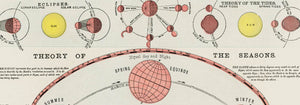
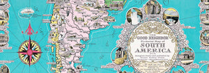
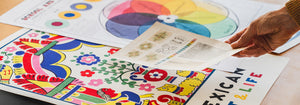
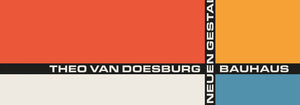
The edit will be broad, but not random. Some pieces may speak the language of Belle Époque color, with persuasive curves and theatrical silhouettes; others may lean toward Bauhaus discipline, where type, grid, and primary tones become architecture. Japanese woodblock influence, Art Nouveau ornament, mid-century food packaging, and early scientific illustration all offer different ways to look closely. For context, future arrivals will converse with classic art, advertising posters, and the more research-led atmosphere of exhibition prints.
Using Fresh Arrivals at Home
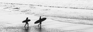
In interior design terms, a latest-arrivals page is useful because it keeps the eye agile. A room can change through one carefully chosen art print: ochre to warm walnut, cobalt to sharpen linen and chrome, black typography to steady a busy gallery wall. Small works can sit above a bedside table or kitchen shelf; larger compositions can hold a hallway, studio, or dining room. Pairing new finds with botanical studies or black and white photography creates contrast without visual noise.
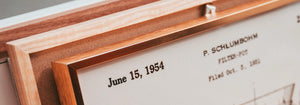
How We Will Curate the Page
The collection will favour pieces with character over mere novelty. We look for images with a reason to exist: a memorable palette, a disciplined margin, an eccentric animal, a city reduced to atmosphere, a face drawn with economy. Frames should respond to the print rather than dominate it. Warm oak can soften academic subjects; slim black mouldings suit graphic work; natural aluminium can make a modernist sheet feel crisp. Orientation will matter too, so vertical statements from vertical posters and calmer formats from horizontal posters will both have a role. As the page opens, it becomes a quiet diary of acquisition, showing how visual culture keeps returning in cycles: a color once used to sell absinthe, a diagram made for classrooms, a theatre bill shaped by nightlife. That mixture is what makes latest posters rewarding for home decor; it lets a collector follow curiosity, not a fixed formula, and build a wall slowly, with attention.