


You may also like
-
Wake up and read Poster
Unknown artist · 1961 · Modernist reading campaign poster with bold typography and crisp red and blue contrast
Poster from €9 · Framed from €16
Regular price From €6,00Regular price -
Swing into books Poster
Unknown artist · 1964 · Playful Book Week poster of a reading child swinging from a flamingo
Poster from €9 · Framed from €16
Regular price From €6,00Regular price -
Take a book Poster
Bill Sokol · 1966 · Mid-century poster of a woman reading in a yellow hat with a relaxed summer atmosphere
Poster from €9 · Framed from €16
Regular price From €6,00Regular price -
Enjoy summer more Poster
Bill Sokol · 1966 · Playful Shakespeare poster with birds and books in bright mid-century colors
Poster from €9 · Framed from €16
Regular price From €6,00Regular price


-

"Very nice Posters. The quality is amazing and we received it very quickly !"
-

"A shop to visit absolutely. Huge selection of posters. We spent more than an hour there !"
-

"Perfect to find gift. Price are very good. An they can frame and pack it on site"


About the Artist
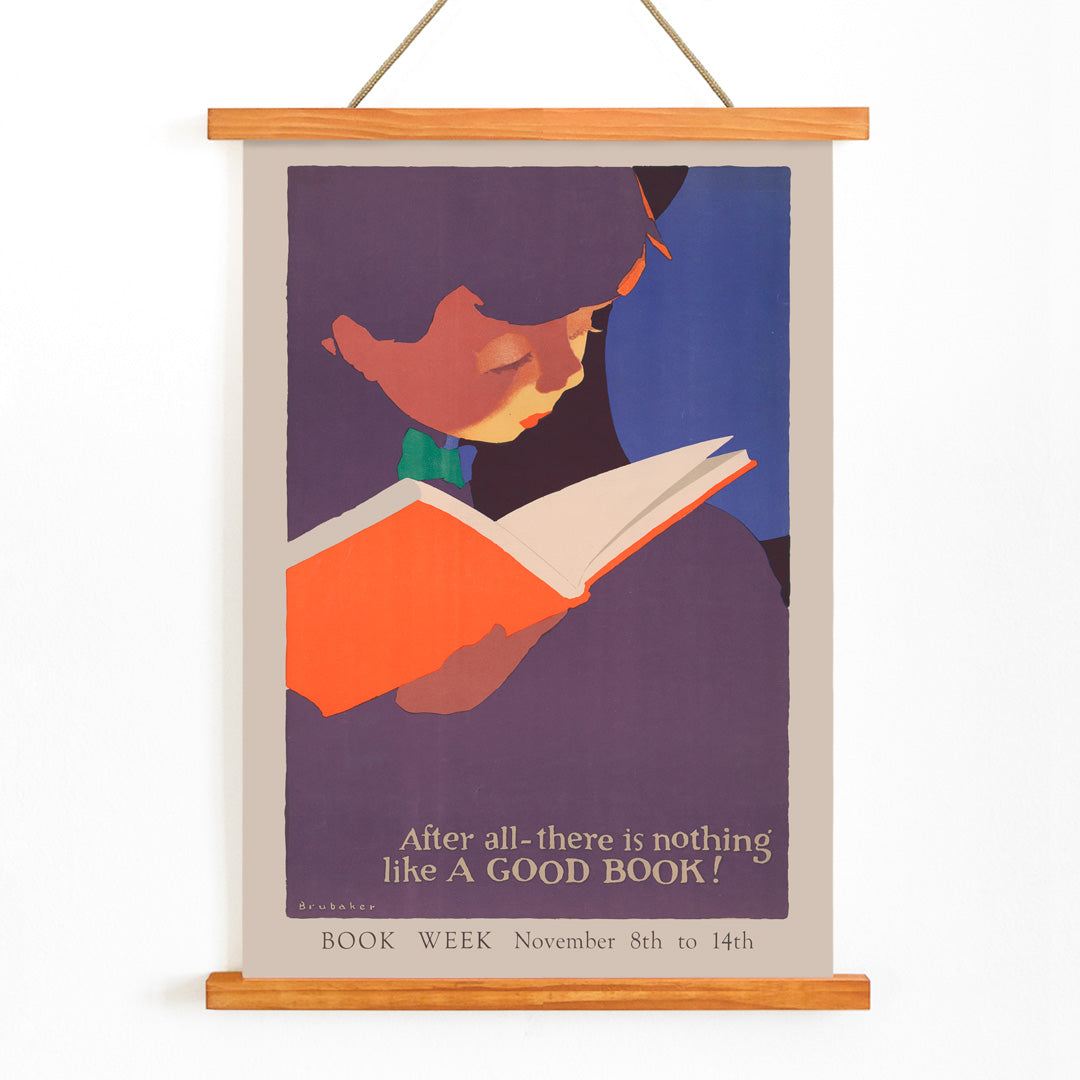
Jon O Brubaker was active during the golden age of American illustration, a period when posters and magazine art played a vital role in shaping public culture. Working in the 1920s, Brubaker was known for his accessible, engaging approach to commercial art, combining expressive character work with striking graphic design. His contributions reflect a time when visual storytelling was central to everyday life and public campaigns.
If you appreciate vintage graphic design, discover more vintage advertising posters and explore highlights from our curated collection.
The Artwork
Nothing like a good book was created in 1925 as part of a broader movement to promote literacy and the joys of reading. During this era, libraries and civic organizations used posters to encourage reading as a valuable habit and a means of personal growth. The artwork captures the optimism of the time, inviting viewers to embrace books as gateways to imagination and knowledge.
This piece reflects the spirit of community learning and the belief that access to books could enrich everyday life, making it both a historical artifact and a timeless celebration of reading.
Style & Characteristics
This 1920s poster features a young girl absorbed in her book, rendered with simplified forms and bold outlines that ensure clarity from a distance. The composition is tightly focused, drawing the viewer’s attention to the act of reading, while the strong graphic border frames the central figure with energy typical of the period.
The color palette is lively, dominated by rich purples and reds, complemented by beige, blue, and green accents. The overall effect is warm and inviting, with a playful mood that feels both nostalgic and fresh, making this poster a striking choice for a variety of interiors.
In Interior Design
This reading-themed poster brings a thoughtful, uplifting presence to spaces like libraries, bedrooms, hallways, or home offices. Its graphic clarity and vibrant colors pair well with mid-century modern, eclectic, or minimalist decor, and it remains visually strong among bookshelves or gallery walls.
For harmonious styling, echo the purples or reds in textiles or accessories, and consider beige or neutral walls to highlight the artwork’s warmth. It also makes a delightful addition to kids rooms, fostering a love of reading and curiosity.